How to Add Text in CapCut (Step-by-Step Guide)
If you want cleaner storytelling on short-form video, learning how to add text in capcut is one of the highest-leverage skills you can build. Text is not only decoration; it carries hooks, punchlines, subtitles, chapter cues, and calls to action for viewers who scroll with sound off. In this guide, you will learn where to insert text layers, how to style them for mobile readability, and when to animate them without making the frame feel chaotic. Before you start, install the latest build from CapCut download so the text panel matches current menus. If you are learning from examples, browse CapCut tutorials for practical workflows, and check CapCut for PC if you prefer editing on a larger screen. By the end, you will have a repeatable system for writing, styling, timing, and exporting text that stays legible on every platform. You will also learn practical text-safe zones, pacing rules for short lines, and a final quality check routine that catches unreadable captions before publishing. The workflow is designed for creators who need speed and consistency, not one-off decorative typography. The same steps cover how to add text on capcut and add text in capcut for hooks, lower-thirds, and subtitle tracks.

Create Text Layers With Intent
Start by deciding each text layer’s job before you type anything. Hook text, explanatory text, and CTA text should not share the same style because viewers process them differently. In CapCut, add short blocks rather than one giant paragraph so you can time each line to the exact spoken idea.
Use the Text menu to insert baseline layers first, then duplicate and edit for speed when formats repeat. Naming layers helps on dense timelines, especially when you stack subtitles, labels, and lower thirds in one sequence. A clean structure prevents accidental edits right before export.
Writers often overfill frames with text because phone previews seem forgiving during editing. Reduce words until each line can be read in under two seconds. If a sentence needs more time, split it into two cards instead of shrinking font size until readability collapses.
Style Fonts for Mobile Readability
Choose font families based on clarity, not novelty. Sans-serif fonts with medium weight usually survive compression better than thin scripts. Keep high contrast between text and footage by adding stroke, shadow, or a subtle background box whenever the scene has fast lighting changes.
Hierarchy matters more than effects. Make your headline larger, support text smaller, and keep consistent spacing so the eye knows where to look first. Viewers should understand the message in one glance without pausing playback to decode decorative typography.
Test styles on multiple clips inside the same project. A white caption that looks perfect on a dark intro may disappear over daylight b-roll later. Building two or three saved style presets for dark, bright, and mixed backgrounds saves time and avoids last-minute visual firefighting.
Animate Text Without Overediting
Motion should reinforce meaning, not compete with it. A simple fade-up or slide-in works for most educational and product content because it introduces text smoothly without distracting from footage. Reserve heavy bounce or spin animations for comedic beats where exaggeration supports the tone.
CapCut lets you combine entrance, loop, and exit behavior, but stacking all three on every layer creates visual noise quickly. Use one strong motion decision per card, then keep timing consistent across the section. Consistency makes your edit feel intentional rather than random.
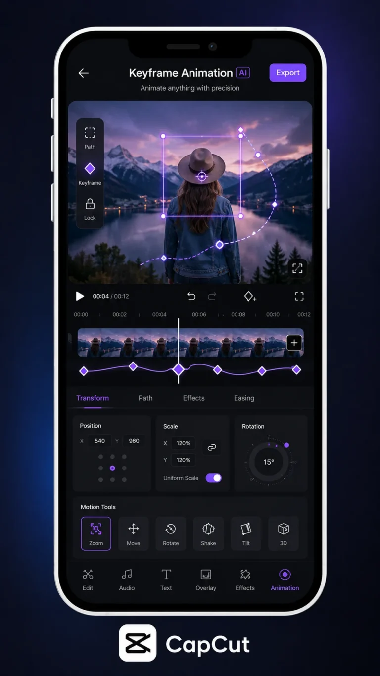
When you need precision, keyframe position or opacity instead of relying on presets. Manual moves are slower initially, but they give cleaner control around beat hits and dialogue pauses. Once you build one polished animation block, duplicate it across similar scenes for efficiency.
Match Text Timing to Speech and Cuts
Good timing is about cognitive load. Place text slightly before or exactly on the spoken phrase so viewers can read and listen in parallel. If text appears late, audiences feel friction because the audio has already moved on to the next idea.
Use waveform peaks and cut points as anchors. For talking-head videos, align key words to emphasis moments in speech. For montage edits, sync short text cards to visual transitions so each card lands like a chapter marker instead of floating awkwardly between clips.
Never let important text sit behind platform UI zones. Keep crucial words above caption bars and below top overlays used by apps like TikTok and Reels. A final safe-area check before export prevents the most common distribution mistake in text-heavy edits.
Export and QA Text Across Devices
Before final export, run a full-screen watch-through at normal speed and a second pass at 0.75x for detail checks. Look for clipped letters, awkward line breaks, and cards that disappear too quickly. Small timing errors are invisible in editing mode but obvious in final playback.
Export one short preview first, then review on the actual phone model you use most for publishing. Screen brightness, color profiles, and app compression can change how text feels. This quick test avoids posting a full project with unreadable overlays.
Archive your best-performing text styles as templates. Over time, this creates a brand system that accelerates production and improves consistency. Instead of reinventing typography every week, you can focus energy on messaging and story structure.
Frequently Asked Questions
Download CapCut Mod APK
Master how to add text in capcut with premium tools unlocked. Download CapCut Mod APK.